2017aug09. Hello and welcome to the Cardhouse Historical Archive of Cardhouse And The Web In General.
Cardhouse itself started in 1990 as the backing organization for X Magazine. My friend was attending university some time in 1994 and he called me on the landline telephone and said "hey, there's this thing you need to know about ... it's called the world-wide web." "Like a spider's web?" I asked, cowardly cringing. "Yeah," he said. "It's a network with photos and links ... but it's really really slow."
Armed with this warning, I bipped around a bit and apparently became intrigued enough to start making my own homepage in November of 1994, most likely even before that. Here is a portion of the original log file web page which is mysteriously fuchsia. This was back during the brief period when Cardhouse was Dryer but was switched back because (among other reasons) the confusion of being mistaken for a casino was more fun than the confusion of being mistaken for an appliance vendor.
[Side note: I was going to shift into the fifth gear of the casino situation with a P.O. Box in Las Vegas, Cardhouse casino chips etc but then I got distracted by a ladybug or something. I have hundreds of very-almost stories]

Back in the go-go 90s, people made little gifs for the various sections of their websites. Here is a collage I created from images dated November 15 1995.
Around that time my body was rotting in a Fortune 500 company wearing sweaters and enduring taunts from upper management. "Perhaps I could start a freelance web design thingie," I thought occasionally. But I would always return to the awfulness of HTML. "Surely they'll all pivot to some sort of super-Postscript thing any second now. It couldn't get much worse, though." Then the CSS recommendation dropped in 1996. What a hot load of endless grief. I pat myself on the back at least once a month for avoiding that potential rat's nest of bullshit ... it's bad enough doing this for myself. For a CLIENT? Dear lord.
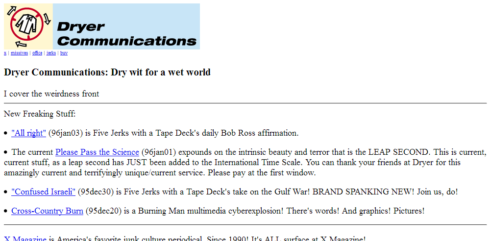
Here's the top of a home screen from January 1996. What a homely little thing. I bailed on the "weirdness" take almost two decades ago. The "normals," those are the real weirdos.
A collage from June 15 1996.
One from November 5 1996.
The home page changed a lot between 1994-1998 but for the most part I have only the very minimalistic backgrounds from then. But this (from 1997) was one of my favorites. I'm sure type on top of it looked wonderful.

The Cardhouse.com domain started August 1 1997. Before then, it was sitting on a number of janky ISPs with /directory/structures/like/~this/xmag.htm. Below is an old page of links from November 5th 1997. How many of those zines are still around? My guess is zero. [LQQKS] Okay it was more than zero. RIP 97.3% of this lot.
Entropy has been my go-to pocket ace every time some jagoff copies some inane bit of rambling from this site. "Ahhhhh, they'll be dead soon enough." And then n years later, sure enough, the domain is 100% gone and I lean back in my recliner with a newly-cracked young coco-nut and a straw. "Ahhhhhhhh, later chump," I say between glorious, fresh sips. I'M PLAYING THE LONG CON STEP OFF.
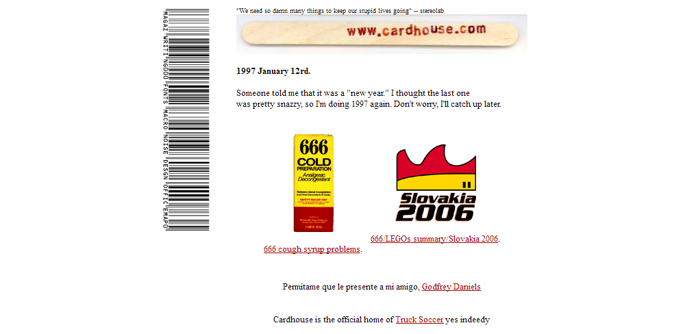
Incredibly old home screens remind us that much has changed with technology, yet much has remained the same except for the different parts. Here below is a Cardhouse home screen from January 12 1998.
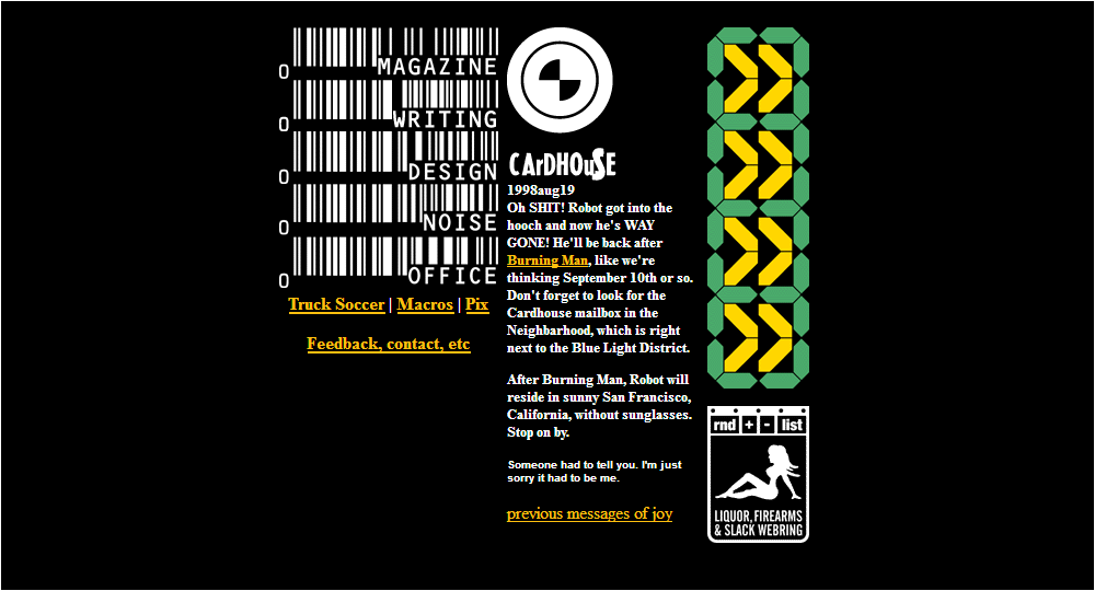
Here below is a Cardhouse home screen from August 19 1998. The large green/yellow link icons were from the Playstation videogame "Wipeout 2097" and pointed to Chank, Rotodesign, Superbad, and Fray.
In the old times before logic, everyone made tiny buttons for their website. They were so small! Some of them were animated so you could really emphasize how important it was about the teen sluts. Here below, a selection of buttons. I'm sure there are more out there. I'm afraid to look.
Look, there's Music Boulevard! Does anyone remember Music Boulevard? They had so many coupons. What you would do is get a bunch of CDs for like a dollar each then take them and sell them to your local record store for four dollars or so. I think my friend single-handedly bankrupted Music Boulevard. Seriously, it became a family endeavor and the postal carrier would show up way too often at his house with one of those big tubs filt with CDs.
Watching all of these buttons wriggle and shine as a group is making my skin crawl. They're like a horde of informational insects.
These amazing non-threatening/creepy buttons were sourced around November 20 1998 to February 5 1999. I have them because originally I was going to run an ever-expanding page of them ... so these are HAND-PICKED tiny buttons. My favorite one (thank you for asking) is obviously USA Today POTHOLE FIRE. Must have been a Centralia thing. [FX: twenty-second pause (it's six in the morning)] There's no way that's real. Probably from the The Onion.
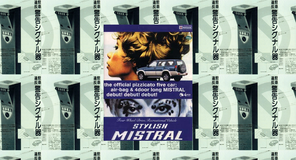
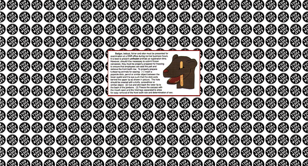
Splash screens were proffered on ancient websites for unknown reasons. "Say," people always asked back then, "is there any way you can put the actual content even farther away from me?" "Yes, I would love to," web site authors answered. "With a 'splash screen.'" "Oh good" no one said in reply.
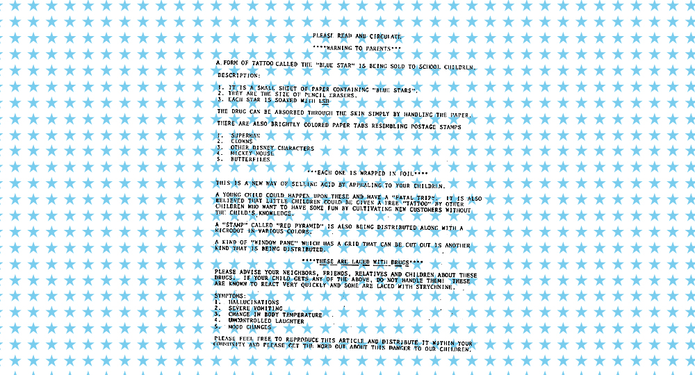
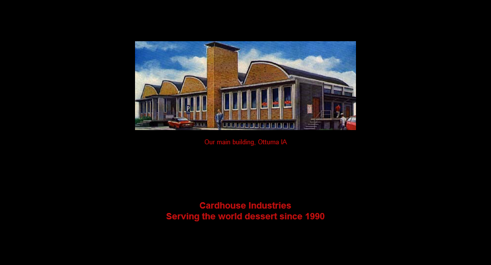
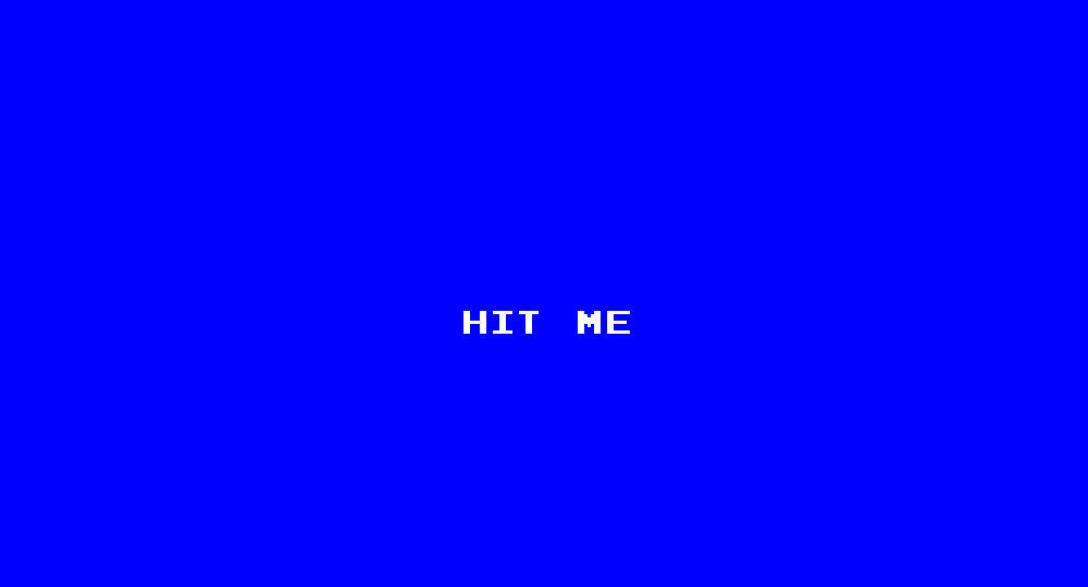
I found these splash screens on a Cardhouse CDR from 1999. I should say "The Cardhouse CDR" because it's the only full backup I can find on that type of medium. I found bits and pieces on some Zip drives back when it was time for those to be chucked. Archiving things wasn't in my wheelhouse back then, I was too hopped up on [insert recreational or pharmaceutical drug here that you also were on in a fabricated show of solidarity]. The splash screens are from October 20 1997 to February 12 1999. The "HIT ME" splash screen was themed with a home page which looked like a video poker machine. Unfortunately I have only scattered half-images for that.
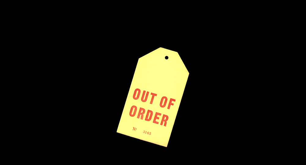
Speaking of drugs, the first splash screen is actually an image of a flyer that was posted at my workplace back around 1994, one of the infamous blue star tattoo memos. It was like seeing a local celebrity! I pulled it off the wall and copied it with the company's copier on the company's dime on company time. A YOUNG CHILD COULD HAPPEN UPON THESE AND HAVE A "COMPLETELY FICTIONAL" "FATAL TRIP."








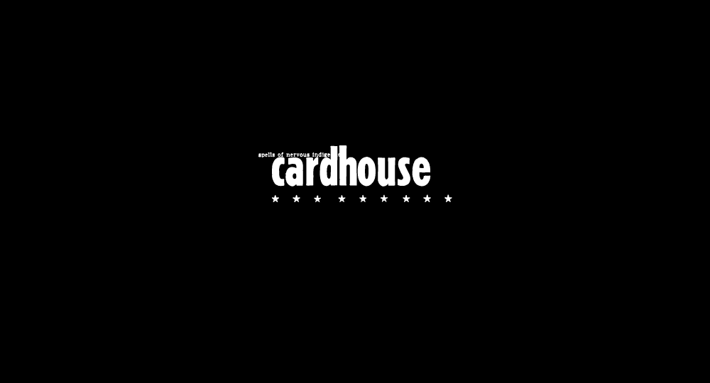


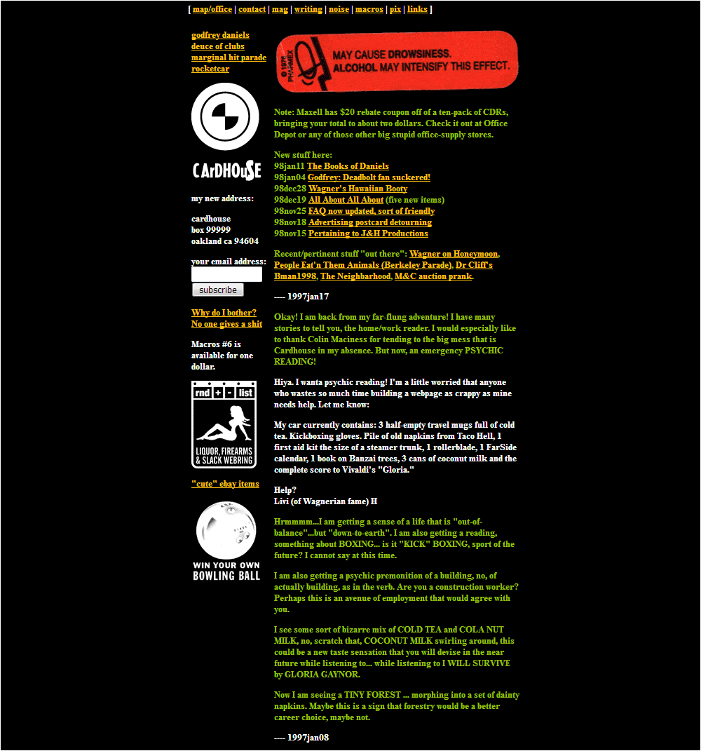
Splash screens, wow. Thanks for stopping by. Here below is a Cardhouse home screen from January 7 1999.
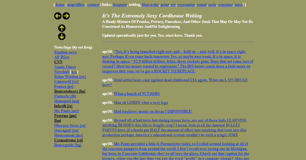
Here's a home page from April 30 1999. Did a lot of design switching in 1999, it was a very frenetic year in many respects. I guess everything was underlined back then. Way too many of my entries back then can be easily summarized with the phrase "heavy breathing; all caps."
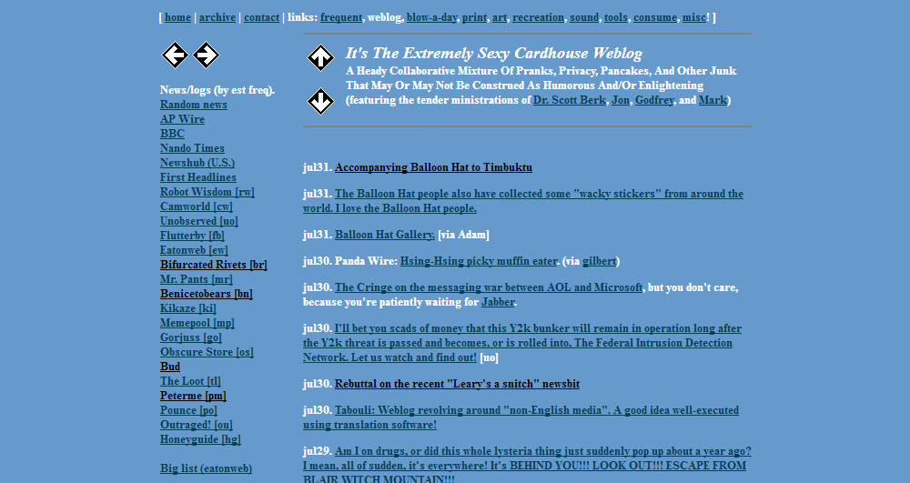
July 31. Still with the underlining. I like the color combination, though. Light blue with darker blue! You'd think it wouldn't work, but THERE IT IS! And look, it's the brief period when Cardhouse was a collective of entry-making organisms. Everyone did a good job and most importantly there was NO FIGHTING.
I found this screenshot of Alexa.com's new-for-1999 feature that would allow advertisers to advertise on sites that didn't allow advertising. It was a holy war back then. Sites that injected advertising, sites that enveloped your site into a frame, on and on.
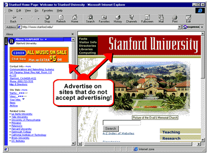
Here below is a Cardhouse home screen from December 24 2000. "What is this, 1996?" Haha, you get 'em, tiger.
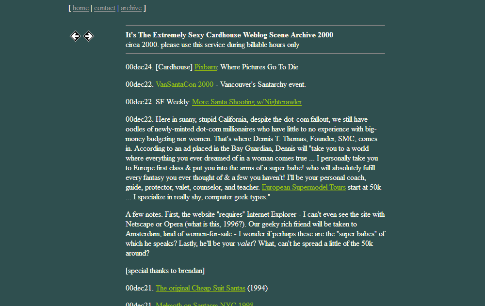
Here below is a Cardhouse home screen from January 3 2005. Apparently I tried the "reverse date order" trick back then as well.
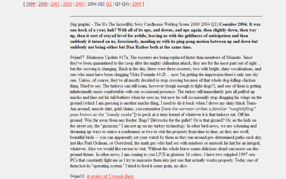
Here below is a Cardhouse home screen from December 25 2010. I tried running some advertising for awhile. There was one person who signed on to a poker site with my affiliate code and really enjoyed playing online poker with actual money. Thank you kindly, random person.

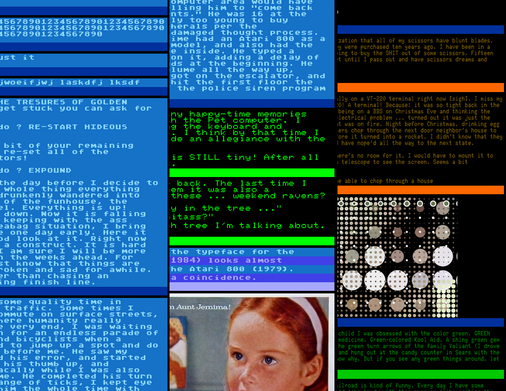
We're in 2015! Time is whooshing forward so fast now. This was the year I decided to do an end-run around CSS and just produce giant images generated by my own janky softwares. Then, when everyone regained their marbles, I could just run a conversion routine to move everything from my text input to whatever shiny new format was out there. It was like cryogenics for web pages. There were problems with this approach as I'm sure you can imagine and of course we're never going to round file CSS because it's part of us now, like rats in a city ... so I re-wrote the program in 2016 to play nice, by the rules and such. Mmmmm I love CSS! Weooooo! [FX: wide, false smile indicates porkies; author surreptitiously slides into frozen capsule labelled "2072"]
Here's a medley of 2015 blatherings.
That's it for now! I'll probably add some more things from time to time. Don't wait up for me.


